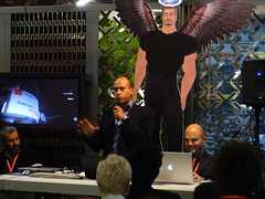
 I’m on a fast train connecting Florence to Milan together with my colleague Luciana (aka the uber wonderful Luciana Gabetti): today I had a talk at the Creativity Festival at the Second Life pavillion on the economy of the Gabetti project in the metaverse.
I don’t want to bother you with so much showcased informations and data (but, if interested, you might want to take a look at my latest presentations – both in Italian and English) but – instead – I’d like to share with you the thoughts that are crosing my mind will looking out of the window, in the glowing dark of the Italian countryside.
Simple is effective. Be simple to be effective or – in other words: increase your simplicity to increase your effectiveness.
I’ll talk about presentations in this post, but – probably – you can adapt this to other scenarios too.
I’m a loyal reader of the Presentation Zen blog and always try to strengthen my slide with Garr‘s tips: I use more images then text, I write short and memorable sentences, I always try to engage my audience. But there’s one thing I ALWAYS do: I keep the technology aspect of my presentations at the stone age: very very few motion effects, no audio and, most of all, absolutely no need for an Internet connection. (and I use Keynote as my slideware)
Why? Because you don’t know anything of the scenario your going to find and the conference centre; you cannot know whether or not the audio mixer will melt up just before your presentation or the internet connection automagically crashes in the very moment you click on the link.
And, my friend, the today conference (albeight being plenty with SL professionals as speakers and a very interested public) was a PRESENTATION INFERNO:
- A speaker (a dear friend, by the way) presented using a cool mash-up that takes selected photos by flickr and let you organize and access them in presentation style mode; BUT he was plenty with shots (really too much) and not very used at the software shortcuts, resulting in most of his presentation time spent passing from one wrongslide to the other (again, wrong)
- Another guy based his introduction to the usage of a very laughable video of a famous italian showman; please note that the video itself wasn’t important but what the showman said in the video was the topic the speaker would have moved on… but there was no audio cable in the room at all; so the presenter tried to move the mic (with a HUGE tweet while passing in front of the speakers system) the mic nearer to the computer speakers… but no sound were heared at all. Creepy.
- On videos, again: a presenter choosed to use a Flash Video… choosing to compile it, in the Flash IDE, during his speech (and, by the way, audio and video were out of sync);The last one. Promise. It’s been a while I learnt an interesting lesson: your audience NEVER know when something in your presentation has gone wrong… until you tell them.
- This man chose to link a file from his presentation but something gone wrong and the magnificent “file not found” window opened. And, adding problems to problem: he started looking for the file in the operating system!
Conclusion: the simpler your presentation is (and I’m speaking about presentation style and technical aspects) the more chance you have to appear a really smart presenter.
P.S. The organizer told me his appreciation for my presentation saying “It was so obvious the you were the marketing guy among the others looking at your presentation style”. Ehm… It’s now 10 years I’m working in IT related teams/companies 
![]()


 I’m on a fast train connecting Florence to Milan together with my colleague Luciana (aka the uber wonderful