Creating the helpdesk experience

We all have, sooner or later depenging on how you feel lucky, a frightening story about helpdesks: labyrintic menus, looping hold-on messages, and ultra-dumb helpdesk guys (ever felt that strange experience when every guy you talk to asks the same identical question before passing your call to the next one?).

Believe me, I’ve always been kinda unlucky with helpdesks. Unfortunately. So I was happy my first day at Gabetti to discover I would have worked shoulder to shoulder with a small helpdesk team serving our 1000 agencies on IT related problems.

Back in June 2006 the only way to contact the helpdesk was to give a call to a phone number behind which laied an exchange that took care of the call forwarding to the first free operator. In other words the process was something like

  1. call the number
  2. stay at least 15 mins (if you’re the lucky boy) on hold
  3. explain your problem to the operator (other 15 mins, at least)
  4. wait until the IT team solves your problem

A syncronous helpdesk is a waste of time for everybody: for who has the problem and for those who solve it.

Then we started innovating the technology and the processes below the IT helpdesk; our keyword was “asyncronous”.

The first step was to provide the support team and our users with a web interface, with proper problems sections, to communicate and manage tickets. We’re really really happy with the open source software OTRS which could be managed both via email and web and is plenty with personalizations.

That was an important shift from syncronous to asyncronous assistace which brought some interesting features to our helpdesk structure:

  • Our clients wouldn’t have to wait for a free operator to communicate their problems anymore
  • We have the power to simultaneously close a large number of tickets in the very moment (that is to say make more users happy in less time)
  • We can prioritize problems (both basing on the quantity and quality data of our users’ problems)

With just this change we obtained a huge (nearly half an hour) speed up of the ticket opening. Not bad, huh?

But the we moved fast forward both from the technology and process points of view: we rolled out Gabi, our Virtual Assistant, back in July to manage the whole help desk front-line and, more recently, we choosed to prioritize our asyncronous tools (such has gabi itself and the online helpdesk) by cutting the telephone helpdesk times from 8 to 3 hours a day.

Even if this strong move towards the asyncronous life style hasn’t already showed its entire potential the results are huge: the mean life time of each ticket is now something less than 1.5 days and the monthly helpdesk performance has gained full 44 man hours (which is something more than the Italian equivalent of the work week).

A tailor-made world

If you read this blog you might know I use the yellow line underground to travel to work; without driving I’m plenty with time to read and, most of all, to let my mind run free. Early this week I was thinking on the strange way that took me from loving baggy pants to the way I dress today.

As I grow-up I’m loving tailor made stuff more and more. I have nice shirts, but I prefere my tailor made ones: they’re more confortable and they simply fit me. Same thing for my suites: most of my preferred are tailor made.

This is probably because of the years on your shoulders teach you how to fall in love for details and how to appreciate the uniqueness. Probably. For me at least.

Tailor-made has always been a synonym of richness. Just think about Ferrari cars: each one is made by hand following its owner’s desires. They even have a dedicated web site.

But we were talking about my thoughts, weren’t we. Yes sorry. Let’s get back to them. While thinking about the way life changed my taste I suddenly realized how the tailor-made=rich equation is becoming less and less common (by the way: my pal Marco helped me discovering a great tailor that prepares shirts for us for just 40 euros, drop me a line if you live in Milan and need her contacts).

Examples? Here they come: each morning I have personalized news and informations via my Bloglines feeds; I sleep on a latex
mattress that modifies according to my body shape and weight; I choose the films/shows I want to see at the time I want them on my IP TV (more to come with things such as Joost); etc. etc.

You might say this is not truly tailor-made; they’re just (very good) approximations of what tailor-made really is. And you might be right.

So what about future trends? I actually see two main trends in this area for the next years.

1. Atoms from bits

The first 3D printers are reaching our desktops with a price that’s more or less the price os a laser printers 15 years ago (or, if you like, you can build one by yourself); today they could be useful for rapid prototyping, but tomorrow? If you imagine a future rich in nanotechs you can then imagine to create your shirt in a 3D modeling environment and then making it real using your printer. Want more? Buy the specs of your favourite digital player and let your “printer” build it for you. Fully functioning.

Kinda too futuristic huh? I agree, even if I think that my generations will see this future. But take a look at the next trend.

2. Personalization through data-mining

Google, the greatest data miner on earth, has started the creation of synthetic models of real buildings, linking them to the original through Google Earth geodata and images.
Given a number of items big enough, you might “invent” an object and find a very similar one between these items. You just need a proper way to search for it; and Google is indexing the world: I can imagine to model an object I’d like to have, give the model to google, and shop for the (already existing) approximation of it. Nice huh?

I really think we already have the knowledge and the algorithms to perform such a project. Any Venture listening? (if the answer is es you might want to contact me via Linkedin)”

How simplicity can improve your speech

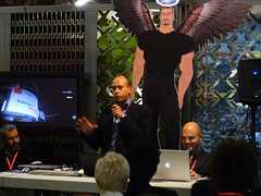
Shot by KallideasI’m on a fast train connecting Florence to Milan together with my colleague Luciana (aka the uber wonderful Luciana Gabetti): today I had a talk at the Creativity Festival at the Second Life pavillion on the economy of the Gabetti project in the metaverse.

I don’t want to bother you with so much showcased informations and data (but, if interested, you might want to take a look at my latest presentations – both in Italian and English) but – instead – I’d like to share with you the thoughts that are crosing my mind will looking out of the window, in the glowing dark of the Italian countryside.

Simple is effective. Be simple to be effective or – in other words: increase your simplicity to increase your effectiveness.

I’ll talk about presentations in this post, but – probably – you can adapt this to other scenarios too.

I’m a loyal reader of the Presentation Zen blog and always try to strengthen my slide with Garr‘s tips: I use more images then text, I write short and memorable sentences, I always try to engage my audience. But there’s one thing I ALWAYS do: I keep the technology aspect of my presentations at the stone age: very very few motion effects, no audio and, most of all, absolutely no need for an Internet connection. (and I use Keynote as my slideware)

Why? Because you don’t know anything of the scenario your going to find and the conference centre; you cannot know whether or not the audio mixer will melt up just before your presentation or the internet connection automagically crashes in the very moment you click on the link.

And, my friend, the today conference (albeight being plenty with SL professionals as speakers and a very interested public) was a PRESENTATION INFERNO:

  • A speaker (a dear friend, by the way) presented using a cool mash-up that takes selected photos by flickr and let you organize and access them in presentation style mode; BUT he was plenty with shots (really too much) and not very used at the software shortcuts, resulting in most of his presentation time spent passing from one wrongslide to the other (again, wrong)
  • Another guy based his introduction to the usage of a very laughable video of a famous italian showman; please note that the video itself wasn’t important but what the showman said in the video was the topic the speaker would have moved on… but there was no audio cable in the room at all; so the presenter tried to move the mic (with a HUGE tweet while passing in front of the speakers system) the mic nearer to the computer speakers… but no sound were heared at all. Creepy.
  • On videos, again: a presenter choosed to use a Flash Video… choosing to compile it, in the Flash IDE, during his speech (and, by the way, audio and video were out of sync);The last one. Promise. It’s been a while I learnt an interesting lesson: your audience NEVER know when something in your presentation has gone wrong… until you tell them.
  • This man chose to link a file from his presentation but something gone wrong and the magnificent “file not found” window opened. And, adding problems to problem: he started looking for the file in the operating system!

Conclusion: the simpler your presentation is (and I’m speaking about presentation style and technical aspects) the more chance you have to appear a really smart presenter.

P.S. The organizer told me his appreciation for my presentation saying “It was so obvious the you were the marketing guy among the others looking at your presentation style”.
Ehm… It’s now 10 years I’m working in IT related teams/companies :-)