Label alignment in forms

Once in a while an article author writes his silver bullet and receives fame, money, power and girls from it… well… sort of :-)

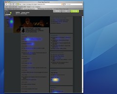
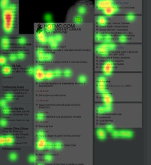
My most read creation is without a doubt the 2006 article, appeared on the US web magazine UXmatters, Label placement in forms: I prepared an experimental set-up to test different types of forms using eye-tracking technology and reported my findings in the article.

Well, not only it’s the most read article ever on UXmatters; it attracted more than 100 comments and it’s a top referenced article when speaking about form designs: the findings were largerly included in the 2007 book “Web form Design” by Yahoo Chief Design Architect, Luke Wroblesky.

Recently the nice people at UXmatters have been so kind to prepare an article for their column “Ask UXmatters” were my findings were hilighted again with contributes by highly experienced UX people such as Michael Griffith—User Experience Director at Hewlett-Packard or Whitney Quesenbery-Past-President, Usability Professionals’ Association (UPA).

Some of them do agree with me, some others don’t. But that’s not the point (I’m always happy when people disagree with me, because that is the point were the discussion starts). The fact is that I’m really re-energized to work at a brand new article on form design tested using eyetracking technology and something new might come out in the forthcoming months.

Is clicktracking the new eyetracking?

A couple of months ago I wrote a post to point out my personal view on what was considered the low cost alternative to eyetracking: clickrtracking, via a web 2.0 application called Crazy Egg.

My post raised some buzz that eventually lent to an invitation from the Crazy Egg crew to their private beta program. I was happy to accept since I was so curious on the effectiveness of the results.

To summarize my position (disclaimer: the company I work for sells Eye-tracking services):

  • You should care of what your users sees MORE then of what they click (otherwise you won’t be able to figure out why they haven’t clicked on certain links);
  • The users interactions with a web site/interface shouldn’t be summarized to just their clicks;
  • Crazy Egg is a cool app for zero-budget websites who care fo some more information on their users’ activity;
  • Even though Crazy Egg disappears when compared to Eye Tracking technology it totally stands over all the other log analyzer softwares.

After joining the beta testers group I tried Crazy Egg first on this site (too few clicks) and then on the HOTMC.COM web site homepage, collecting a total amount of 3432 clicks in 10 days.

Have I changed my mind? IS click-tracking the NEW eye-tracking?

Well. no.

Crazyegg: the future for statistics? HeatmapHOTMC.COM Homepage heatmap

As you can see from the above pictures (click on them to zoom in) the results on click hot areas reported (on the left) are completely different from gaze hot areas.

Questions such as:

  • Is my logo placement effective (e.g. Is my logo seen/perceived)?
  • Is the top-left menu perceived as the main navigation widget?
  • Is the design of the central (main) column effective?

remain sadly unanswered in the left image but find some anwers on the right one (the eye tracking one, so to say).

You can also see how click behaviours differ from sight behaviours: you don’t click everything you’ve seen and – interestingly – one of the least seen elements on the page (the Hotboard link nearly the base of the right most column) is the MOST clicked (I can give explanation on this if interested, just leave a note in the comments).

To conclude I’ll say that – where affordable – eye tracking remains the best way to user/reality check you designs (as said before Tobii eye tracking systems record the clicks too) but Crazy Egg is probably the best statistic visualization tool I’ve ever seen (a whole lot more then Webtrends) and let you discover some interesting data on your users’ click behaviours (in the above case we discovered that our users used the HOTMC.COM site to access our community forums).

Gabetti website redesign – BETA version online

Just 8 months ago the Gabetti website looked as picted below, starting from July 2006 we worked hard to publish a brand new website with all the bells and whistles a website should have in 2007 (XHTML+CSS, accessibility, cool interfaces, some ajax magic, usability and a little bit of web2.0ness). The first result was a dead-man-walking, low budget version of the site created in a couple of weeks and useful to convey the Group new identity.

Gabetti website - last year redesigns

I’m now honoured to announce that, after a long & working hard weekend we published this night the redesigned version of the Gabetti Property Solutions Agency website and the brand new version of the Gabetti Group website (disclaimer: Gabetti is the real estate group yours truly works for).

From the very beginning we wanted the interfaces to be user compliant and the whole wireframing and mockuping phases to be striclty user centred: a lot of work both from Nurun (the agency that developed the site) and us was spent into this. Moreover, we performed a full optional eye tracking study on all the interfaces throughout the whole design phase, a tough job that rewarded us with great usability, at last – I’ll talk about the study once we formally publish it.

This is a beta version and a lot of work needs to be done in the forthcoming month. I’ll update you on major releases here, preparing for the official launch by owr very own Marketing department.

Stay tuned. Stay foolish.