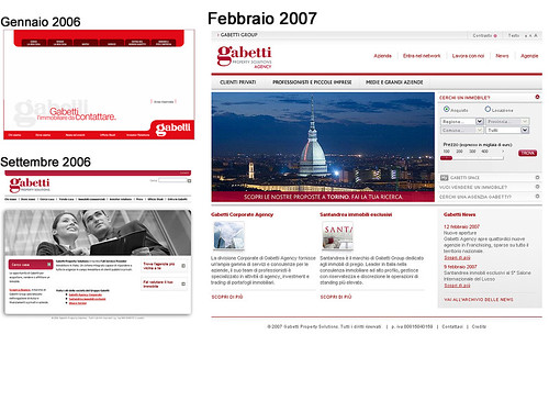
Just 8 months ago the Gabetti website looked as picted below, starting from July 2006 we worked hard to publish a brand new website with all the bells and whistles a website should have in 2007 (XHTML+CSS, accessibility, cool interfaces, some ajax magic, usability and a little bit of web2.0ness). The first result was a dead-man-walking, low budget version of the site created in a couple of weeks and useful to convey the Group new identity.
I’m now honoured to announce that, after a long & working hard weekend we published this night the redesigned version of the Gabetti Property Solutions Agency website and the brand new version of the Gabetti Group website (disclaimer: Gabetti is the real estate group yours truly works for).
From the very beginning we wanted the interfaces to be user compliant and the whole wireframing and mockuping phases to be striclty user centred: a lot of work both from Nurun (the agency that developed the site) and us was spent into this. Moreover, we performed a full optional eye tracking study on all the interfaces throughout the whole design phase, a tough job that rewarded us with great usability, at last – I’ll talk about the study once we formally publish it.
This is a beta version and a lot of work needs to be done in the forthcoming month. I’ll update you on major releases here, preparing for the official launch by owr very own Marketing department.
Stay tuned. Stay foolish.

